CSS Customization
Since QB 13.0, dark theme is introduced. And now, it is easy to do some customization for both light mode and dark mode.
The CSS framework in QB 13.0 is largely based on Tailwind CSS, you can use most of the utility classes as long as QuickBuild has already included, otherwise, you have to provide the css by yourself.
-
- CSS Variables and Color Palette
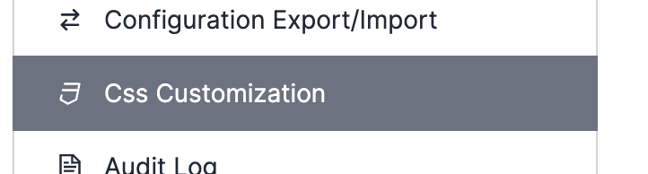
Since QB 13, add your CSS customization from QuickBuild Administration page, where you can find a tab "Css Customization" like below where you can add your css customization:
The color scheme or font system in QuickBuild is using CSS variables. So you can override a color or font by setting the CSS variables, for example, if you want to change the background to stone in dark mode, you can add the customization like below:
.dark {
  --qb-body-bg: var(--qb-color-stone-800);
}
Here, --qb-body-bg is a variable and --qb-color-stone-800 is another variable which has been defined in QB system. The default color palette can be found in Tailwind site below:
https://tailwindcss.com/docs/customizing-colors
NOTE
Please note that in most cases, colors in QuickBuild is in format: rgb(R G B / OPACITY), for example: rgb(255 255 255 / 0.8) and we define the color variable like --qb-color-stone-800 only the RGB part like below:
--qb-color-stone-800: 41 37 36;
We'll specify the opacity value according to the element context.
In QuickBuild, almost every component in the GUI uses CSS variables, if you want to know what kind of variables it used, it is very important to inspect the element from browser developer tools. For example, if you're using Google Chrome, you can press F12, or just right click the element and select "Inspect", then it will show you all CSS related stuff. See more detailed on Chrome Developer Tools or developer tools document of your browser.
Below code list all variables (mostly are colors) we override the light theme in dark mode:
.dark {
    /* GLOBAL STATE COLORS */
    --qb-color-success: var(--qb-color-green-500);
    --qb-color-danger: var(--qb-color-red-500);
    --qb-color-warning: var(--qb-color-yellow-500);

    --qb-color-primary-focus: var(--qb-color-blue-400);
    --qb-color-danger-focus: var(--qb-color-red-400);
    --qb-color-secondary-focus: var(--qb-color-gray-400);
    --qb-color-neutral-focus: var(--qb-color-neutral-400);
    --qb-color-accent-focus: var(--qb-color-purple-400);
    --qb-color-success-focus: var(--qb-color-green-400);
    --qb-color-info-focus: var(--qb-color-cyan-400);
    --qb-color-warning-focus: var(--qb-color-yellow-400);

    --qb-color-primary-ring: var(--qb-color-blue-700);
    --qb-color-danger-ring: var(--qb-color-red-700);
    --qb-color-secondary-ring: var(--qb-color-gray-700);
    --qb-color-neutral-ring: var(--qb-color-neutral-700);
    --qb-color-accent-ring: var(--qb-color-purple-700);
    --qb-color-success-ring: var(--qb-color-green-700);
    --qb-color-info-ring: var(--qb-color-cyan-700);
    --qb-color-warning-ring: var(--qb-color-yellow-700);

    --qb-color-primary-light: var(--qb-color-blue-800);

    --qb-color-accent-dark: var(--qb-color-purple-100);
    --qb-color-accent-muted: var(--qb-color-purple-900);
    --qb-color-accent-light: var(--qb-color-purple-800);

    /* BACKGROUND COLORS */
    --qb-color-bg-muted: var(--qb-color-neutral-800);
    --qb-color-bg-base: var(--qb-color-neutral-700);
    --qb-color-bg-dim: var(--qb-color-neutral-600);
    --qb-color-bg-dark: var(--qb-color-neutral-500);
    --qb-color-bg-default: var(--qb-color-neutral-900);
    --qb-color-bg-darker: var(--qb-color-neutral-600);
    --qb-color-bg-black: var(--qb-color-neutral-50);
    --qb-color-bg-dialog: var(--qb-color-neutral-700);

    /* TEXT COLORS */
    --qb-color-text-dark: var(--qb-color-neutral-50);
    --qb-color-text-emphasis: var(--qb-color-neutral-50);
    --qb-color-text-default: var(--qb-color-neutral-400);
    --qb-color-text-muted: var(--qb-color-neutral-500);
    --qb-color-text-focus: var(--qb-color-neutral-50);
    --qb-color-text-light: var(--qb-color-neutral-500);
    --qb-color-text-neglected: var(--qb-color-neutral-700);
    --qb-color-text-placeholder: var(--qb-color-neutral-600);

    /* BORDER COLORS */
    --qb-color-border-disabled: var(--qb-color-neutral-800);
    --qb-color-border-light: var(--qb-color-neutral-800);
    --qb-color-border-default: var(--qb-color-neutral-700);
    --qb-color-border-dim: var(--qb-color-neutral-600);
    --qb-color-border-dark: var(--qb-color-neutral-500);
    --qb-color-border-darker: var(--qb-color-neutral-300);
    --qb-color-border-black: var(--qb-color-neutral-50);

    --qb-body-fg: var(--qb-color-text-default);
    --qb-body-bg: var(--qb-color-neutral-900);

    /* TYPOGRAPH */
    --qb-headings-color: var(--qb-color-neutral-100);
    --qb-link-color: var(--qb-color-blue-400);
    --qb-color-link-hover: var(--qb-color-white);

    /* BUTTON */
    --qb-input-btn-disabled-border-color: var(--qb-color-gray-600);

    /* TABLE */
    --qb-table-th-bg: var(--qb-color-stone-800);
    --qb-table-th-fg: var(--qb-color-stone-300);
    --qb-table-th-hover-bg: var(--qb-color-stone-500);
    --qb-table-th-hover-fg: var(--qb-color-stone-100);
    --qb-table-th-ordered-bg: var(--qb-color-stone-600);
    --qb-table-th-ordered-fg: var(--qb-color-white);
    --qb-table-td-ordered-bg: var(--qb-color-neutral-700);
    --qb-table-striped-bg: var(--qb-color-neutral-800);
    --qb-scorecard-primary-fg: var(--qb-color-neutral-100);

    --qb-table-settings-td-name-bg: var(--qb-color-stone-800);

    /* ATTEIBUTES TABLE */
    --qb-table-attributes-name-bg: var(--qb-color-stone-800);
    --qb-table-attributes-border-color: var(--qb-color-border-default);
    --qb-table-attributes-on-left-bg: var(--qb-color-blue);
    --qb-table-attributes-on-right-bg: var(--qb-color-green);
    --qb-table-attributes-differing-bg: var(--qb-color-yellow);

    /* TREE */
    --qb-tree-th-bg: var(--qb-color-black);
    --qb-tree-tr-hover-bg: var(--qb-color-bg-base);

    /* BOX */
    --qb-box-head-bg: var(--qb-color-stone-600);
    --qb-box-head-border-color: var(--qb-color-stone-600);
    --qb-box-head-fg: var(--qb-color-neutral-200);

    /* GADGET */
    --qb-gadget-module-footer-bg: var(--qb-color-bg);
    --qb-gadget-placeholder-bg: var(--qb-color-bg-muted);
    --qb-gadget-placeholder-fg: var(--qb-color-text-default);
    --qb-gadget-placeholder-border-color: var(--qb-color-border-dark);

    /* SOURCE VIEW / DIFF */
    --qb-table-sources-line-num-fg: var(--qb-color-red-600);
    --qb-diff-insert-bg-color: var(--qb-color-green-900);
    --qb-diff-insert-fg-color: var(--qb-color-green-50);
    --qb-diff-delete-bg-color: var(--qb-color-red-900);
    --qb-diff-delete-fg-color: var(--qb-color-red-50);

    /* STEP GRAPH */
    --qb-step-head-fg: var(--qb-color-gray-200);

    --qb-step-placeholder-bg: 47 27 8;
    --qb-step-head-muted-opacity: 0.3;

    --qb-step-timeout-icon-color: var(--qb-color-white);
    --qb-step-timeout-head-bg-opacity: 0.5;

    --qb-step-idle-icon-color: var(--qb-color-gray-300);

    --qb-step-hover-bg-opacity: 0.12;

    /* COMMIT BLOCK */
    --qb-num-block-info-bg: var(--qb-color-stone-700);
    --qb-num-block-info-fg: var(--qb-color-stone-100);
    --qb-num-block-add-bg: var(--qb-color-green-600);
    --qb-num-block-add-fg: var(--qb-color-green-100);
    --qb-num-block-modify-bg: var(--qb-color-yellow-600);
    --qb-num-block-modify-fg: var(--qb-color-yellow-100);
    --qb-num-block-delete-bg: var(--qb-color-red-600);
    --qb-num-block-delete-fg: var(--qb-color-red-100);

    --qb-swagger-opblock-bg-opacity: 0.2;

    /* POPUP */
    --qb-popup-bg: var(--qb-color-bg-muted);

    /* JQUERY UI */
    --qb-ui-dialog-titlebar-gradient-from: var(--qb-color-bg-dim);
    --qb-ui-dialog-titlebar-gradient-to: var(--qb-color-bg-muted);

    --qb-ui-widget-overlay-bg: var(--qb-color-neutral-600);

    --qb-ui-draggable-dragging-fg: var(--qb-color-gray-800);
    --qb-ui-draggable-dragging-border-color: var(--qb-color-gray-600);

    /* FORM */
    --qb-form-check-input-bg: var(--qb-body-bg);
    --qb-form-check-input-border-color: var(--qb-color-neutral-500);

    /* STATISTICS */
    --qb-stats-gradient-from: var(--qb-color-neutral-700);
    --qb-stats-gradient-to: var(--qb-color-neutral-800);

    /* MISC COLORS */
    --qb-blankslate-fg: var(--qb-color-yellow-200);
    --qb-color-attention-muted: var(--qb-color-neutral-800);
}